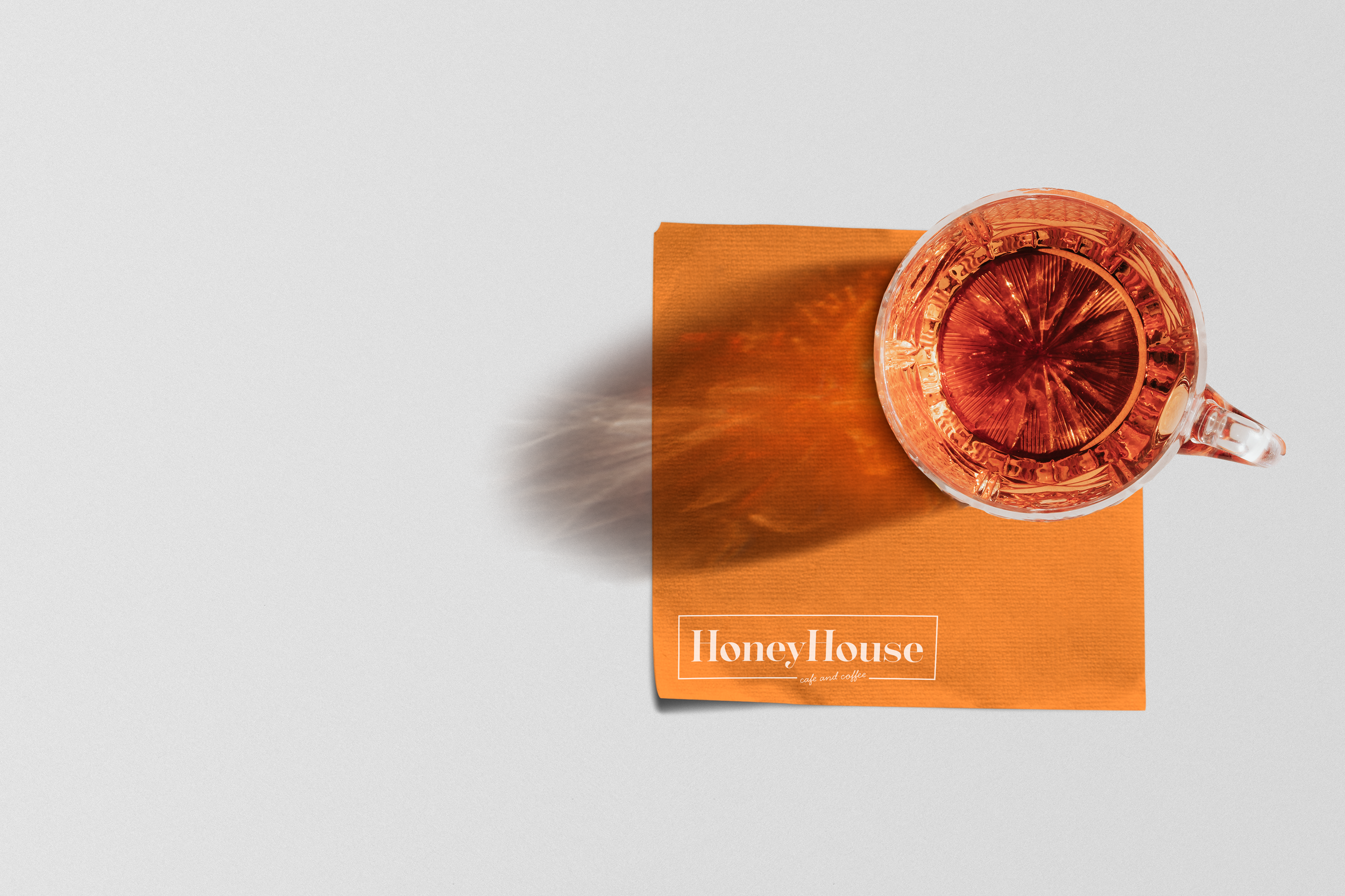
Honey House
Brand Identity
A menu is one of the most important advertising tools a restaurant can have. It can be used to educate a guest about the experience they are about to have; it is an instant snapshot of their brand. The name, cuisine, and style must all be consistently represented in the menu design, and it was my job to plan and execute that through a well-planned layout, fonts, color palette, and use of a typographic system.

The Direction
When brainstorming the cuisine and style, I was drawn to the dreamy Italian aesthetic, filled with bright colors and culturally rich lifestyles. It’s picturesque towns with stunning coastlines and colorful villages draw in tourists from around the world for good reason. Home to espresso and pasta, vistors can’t help but to fall in love with the authentic flavors Italian food.
The Menu
Most Italian restaurants imbue sophistication and elegance, but lose the light and vibrant personality of the Almalfi Coast. In my search, I decided that I wanted to recreate the bright personality of this beautiful country and cuisine through the Honey House Cafe and Coffee.
Cafes offer a modern and vibrant but casual dining experience. The warm and bright color palette creates a colorful and casual personality, perfectly capturing the lighter side of Italy.
The primary typeface, a modern serif, was chosen for its stylish and graceful feel, and balanced by the clean structure of the secondary san serif. In collaboration with the bright colors and line work, the typefaces convey the carefree, modern environment of the Honey House Cafe and Coffee.


