Bold Details & Stylistic Balance
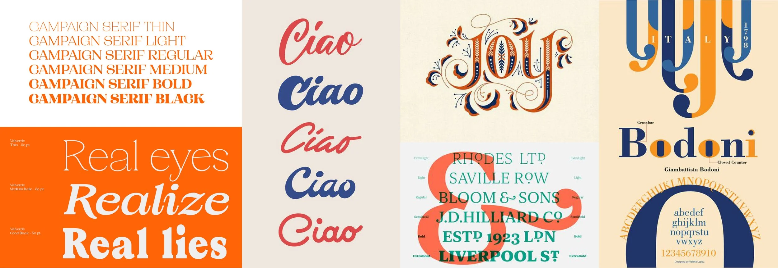
Rooted in print history, type specimens have become a great way to showcase typeface designs by presenting the font family, individual characters and glyphs in a particular theme or context. Showcasing these assets allows designers to view a typeface’s characteristics and assess and compare legibility when appearing in print. Considering this, I was tasked with finding two complimentary typefaces to showcase in my own type specimen through deliberate use of layouts, type as form, and color.

The Direction
Campaign Serif is a beautiful, modern display serif with bold complexity and delicate details, making it the perfect pairing for the simplified form of TT Norms Pro. Pairing them together, I aimed to accentuate the balance of detail and functionality, leaning on a bright contrast of color, line, and pattern as a way of uniquely demonstrating the qualities of this typeface pairing.


